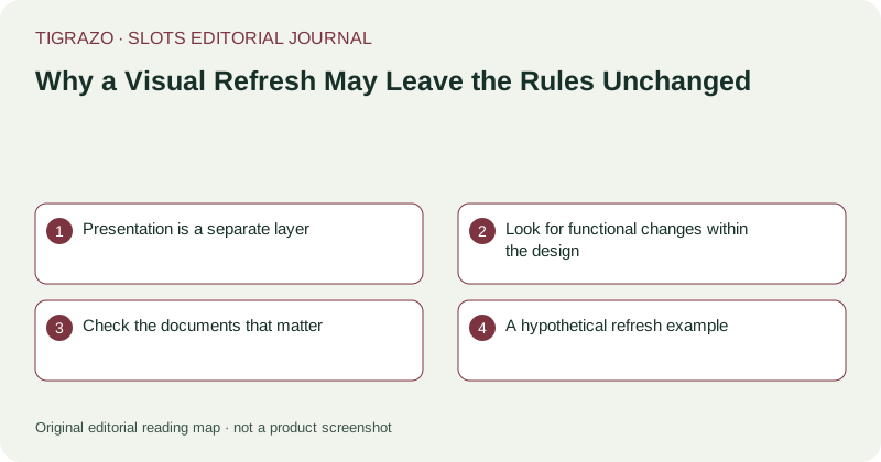
Presentation is a separate layer
Artwork gives symbols an identity, animation shows transitions and sound marks events. These choices shape perception and usability, but they do not by themselves define outcome probabilities. An illustrated symbol can be replaced with another image while retaining its position in the paytable. A visual refresh can therefore be substantial design work without representing a new award structure or a new expected-return model.
Look for functional changes within the design
Not every visual change is merely decorative. Larger text, clearer contrast or a reorganised information menu can affect readability and navigation. A redesigned award display can make gross awards easier to distinguish from net balance changes. Those are meaningful interface developments. They should be described on their own terms rather than justified through unsupported claims that the game is now more generous or more likely to pay.
Check the documents that matter
To assess a rules claim, compare version-specific paytables, trigger conditions, stake definitions and published configuration details. A screenshot comparison cannot establish that probabilities are unchanged, just as matching artwork cannot establish identical mathematics. If a publisher states that rules remain the same, attribute that statement unless independently matched documentation supports it. Absence of an announced change is not proof that every technical detail is identical.
A hypothetical refresh example
Imagine a game whose ordinary symbols receive new illustrations and whose win animation becomes shorter. The documented line rules, award schedule and RTP configuration remain stated as before. An accurate article could describe the presentation changes and the matching published fields. It should not claim that all internal implementation is identical or that shorter animation improves outcomes. Reduced waiting time and mathematical return are separate topics.
Use two editorial checklists
- Presentation: artwork, text size, contrast, animation and audio controls.
- Rules: evaluation method, awards, triggers, limits and configuration.
Keeping the lists separate makes the article more informative. It allows an editor to identify a meaningful accessibility improvement without inventing a mathematical effect, and to identify a rule change that might otherwise be hidden behind familiar imagery.
A refreshed appearance may also increase visual intensity or reduce clarity. Coverage should explain the particular interface consequence rather than assuming all redesign is progress. When no direct usability assessment has been performed, describe the documented change and its possible relevance, not a firsthand verdict. A precise account of scope gives readers more than a broad claim that the game has been transformed.
Symbol identity needs special care after a refresh. If illustrations change, explanatory material should still let readers match each image to its paytable entry. That mapping is a usability detail worth describing separately from any claim about the unchanged award values.